Luna Coffee Company
Branding and package design
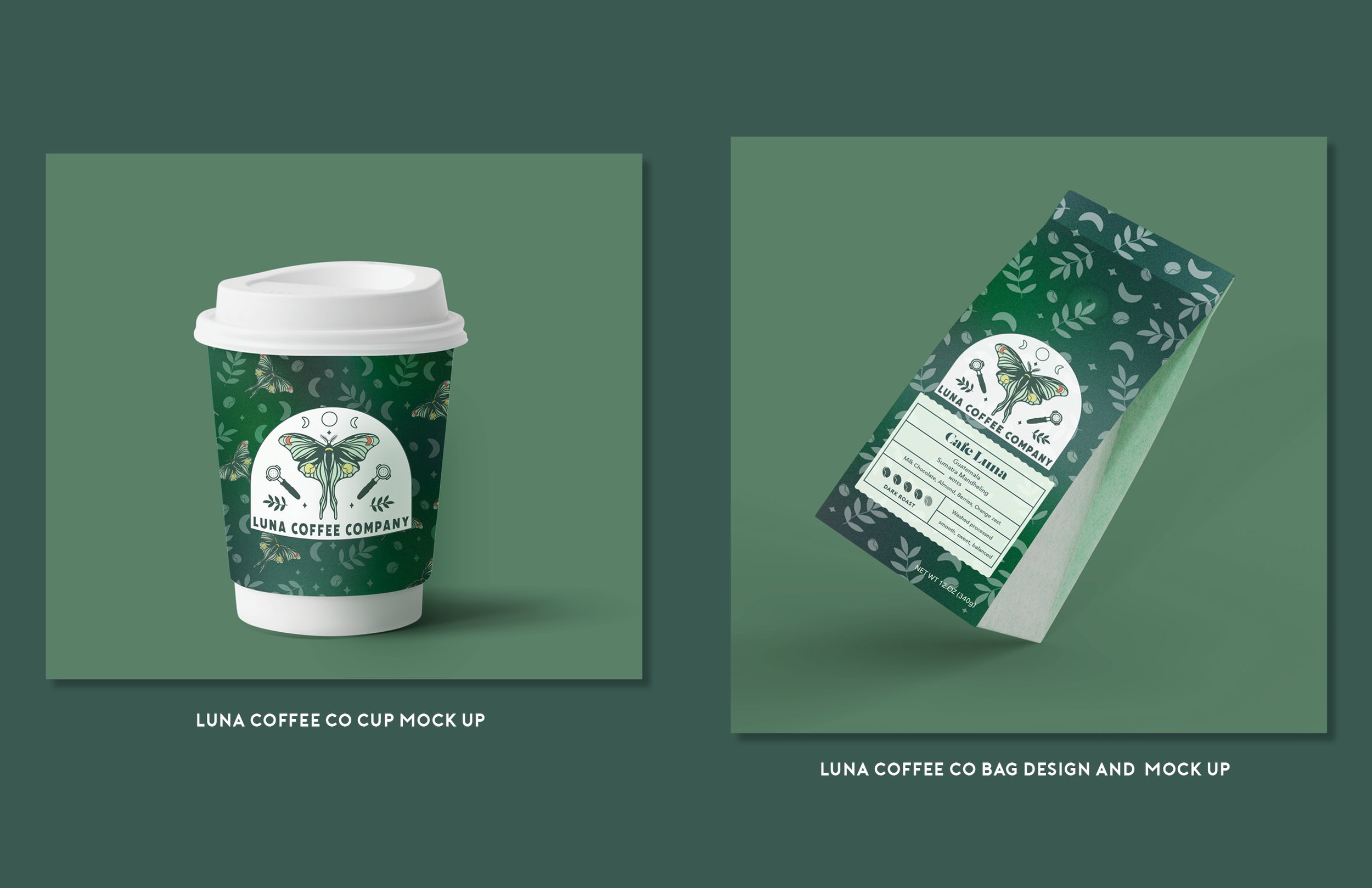
This project was about creating a logo idea for a business. I decided to make a logo for a faux coffee shop. I decided to tie the idea of Luna moths with a lunar moon cycle because naturally, they go hand in hand with one another being predominately nocturnal. Also, most people drink coffee to wake up from being sleepy. I felt like these two should have been a part of the coffee brand. Centered in the logo, I illustrated a Luna moth and incorporated coffee beans in the wings along with crescent moons. I added portafilters to each side of the logo and paired it with a bolder and slightly rougher sans-serif font to make this design feel more established and grounded. The simple leaf design, sparkle elements, and lunar moon cycle add to the visual hierarchy and create balanced symmetry within the new arched logo design. Throughout my branding theme, I used the elements of coffee beans, leaves, and sparkles to create a pattern background for the coffee bag packaging and the coffee cup sleeve.


