Jam Jar | Package design
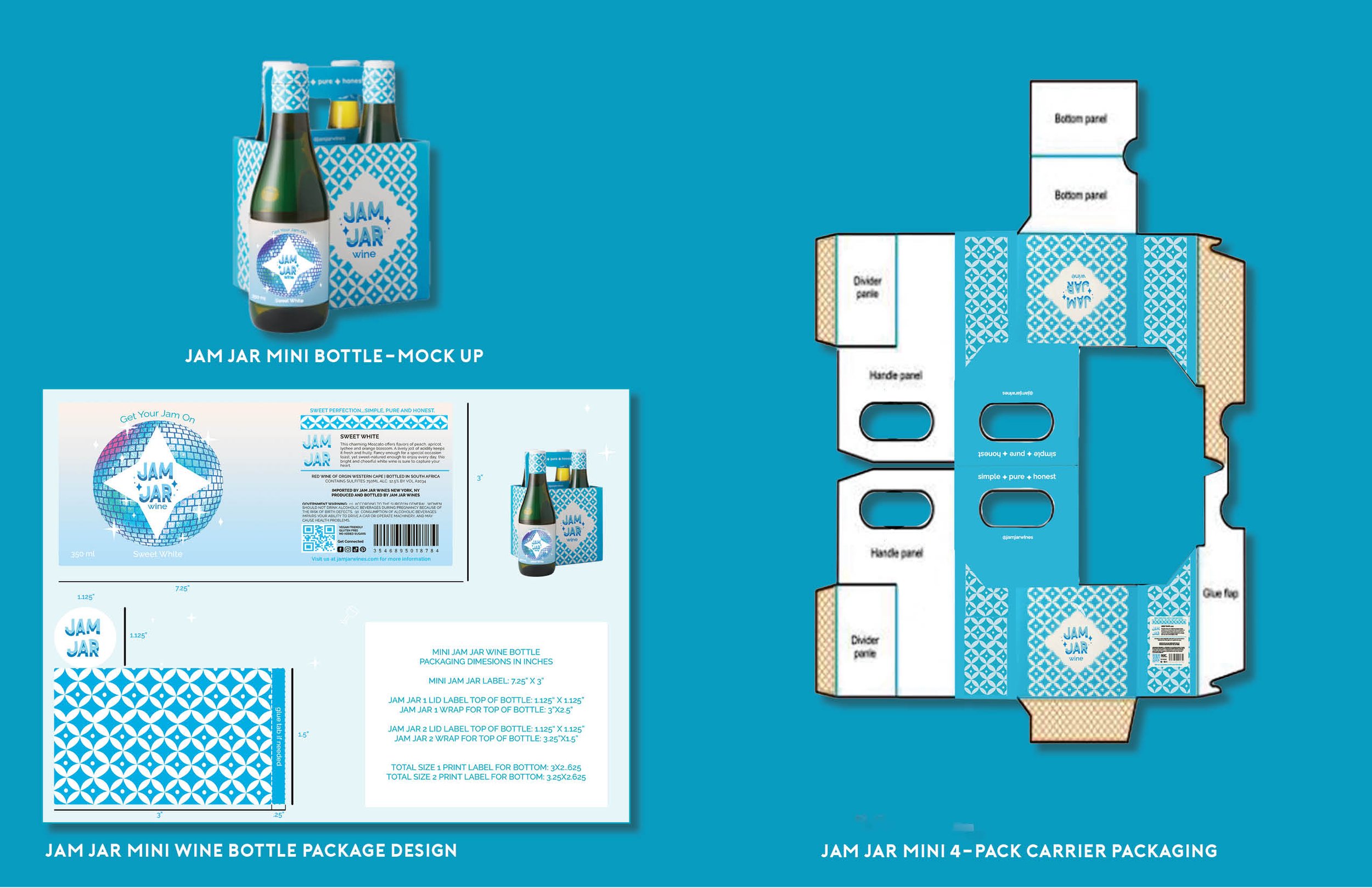
The new and revised logo carries a fun and almost groovy approach, this is accomplished by a bold sans serif typeface, illustrative sparkle elements, and disco ball, and tied in with the distinct eclectic pattern from the previous package design. As shown, each wine flavor variation is distinguished by a different package color variation, this was used from the previous design collection. However, this has been a more successful approach with the duo-toned disco ball, gradient background, and bold-colored font.
Check out the full style guide below!


