Upcycle KC poster and program guide
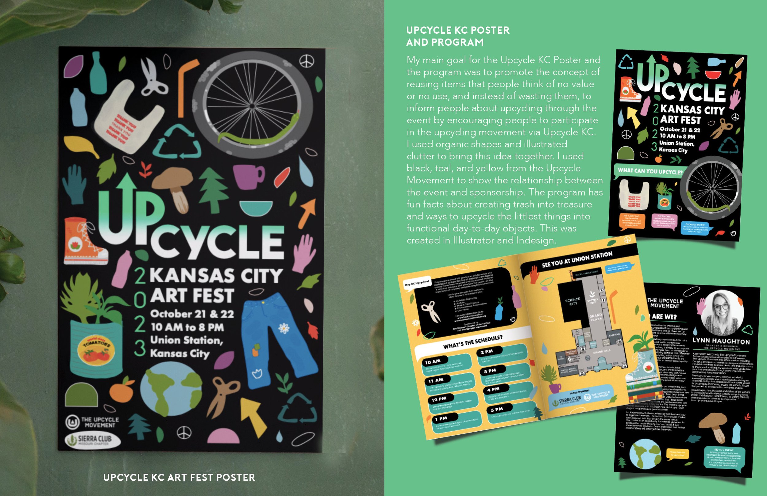
My main goal for the Upcycle KC Poster and the program was to promote the concept of reusing items that people think of no value or no use, and instead of wasting them, to inform people about upcycling through the event by encouraging people to participate in the upcycling movement via Upcycle KC. I used organic shapes and illustrated clutter to bring this idea together. I used black, teal, and yellow from the Upcycle Movement to show the relationship between the event and sponsorship. The program has fun facts about creating trash into treasure and ways to upcycle the littlest things into functional day-to-day objects. This was created in Illustrator and Indesign.

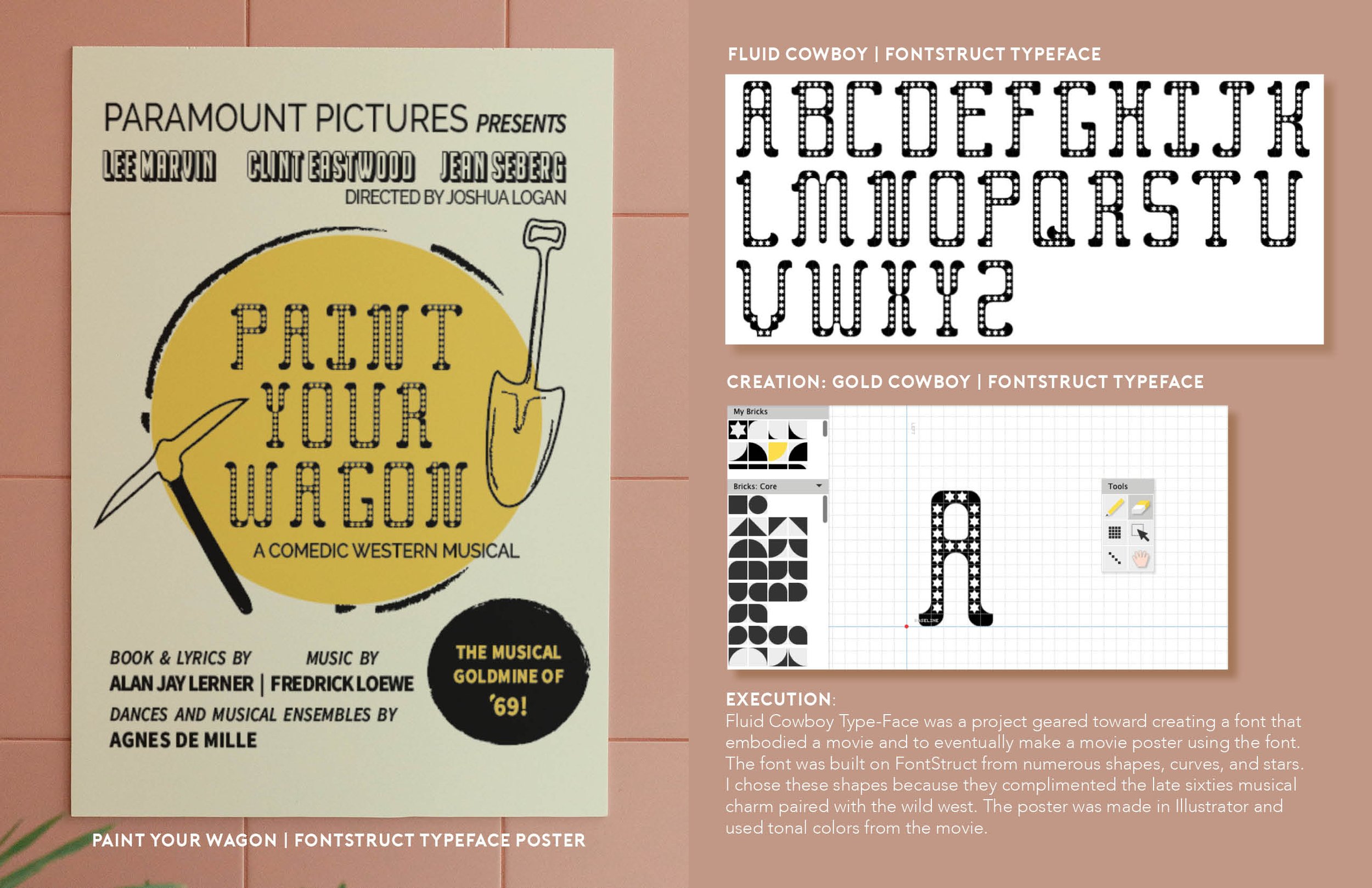
Paint your wagon
FontStruct Typeface poster
Fluid Cowboy Type-Face was a creative endeavor aimed at developing a unique font that captured the essence of a cinematic experience. The project also involved utilizing this distinct font to design a movie poster that would encapsulate the atmosphere of the film. To create the font, I utilized FontStruct to construct it from a variety of shapes, curves, and stars. I specifically selected these shapes because they harmonized with the nostalgic musical vibes of the late sixties, combined with the rugged allure of the Wild West. Furthermore, the movie poster was meticulously crafted in Illustrator, incorporating tonal colors that reflected the ambiance and mood of the movie.

Jazz in the Valley Poster
The Jazz in the Valley Poster was designed for an annual event showcasing local Jazz artists, this poster was submitted as a contest to be the featured poster at the event and intended to be handed out to patrons and guests as memorabilia.
Kansas City has such a strong history of Jazz. The event “Jazz In the Valley,” was sponsored by the American Jazz Museum. With this in mind, I wanted to pay homage to Kansas City and its vast history But also add a few modern twists.
I drew inspiration from researching vintage jazz posters, I looked at posters with front runners such as Louis Armstrong and Little Richard. These Posters shared some unique qualities that I wanted to emulate in my posters, Such as the cut-out black and white images of the musicians, geometric shapes and stars, and bold color concepts. This was created using Illustrator and Photoshop.

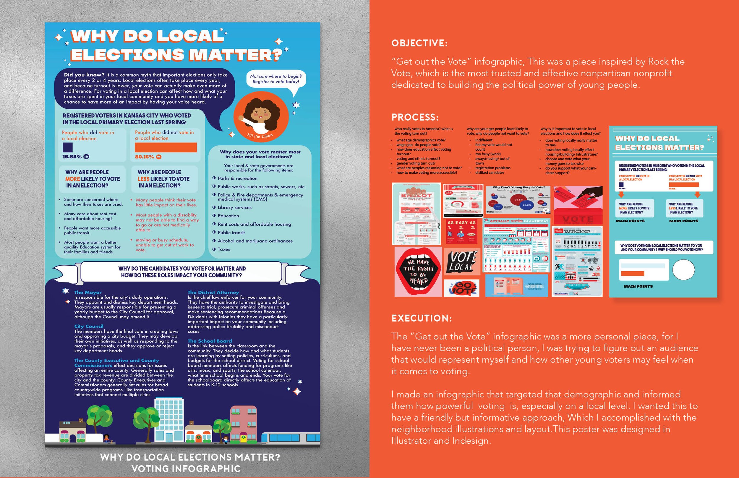
‘Why Do Local Elections Matter?’ Voting Infographic
“Get out the Vote” infographic, This was a piece inspired by Rock the Vote, which is the most trusted and effective nonpartisan nonprofit dedicated to building the political power of young people.
The “Get out the Vote” infographic was a more personal piece, for I have never been a political person, I was trying to figure out an audience that would represent myself and how other young voters may feel when it comes to voting.
I made an infographic that targeted that demographic and informed them how powerful voting is, especially locally. I wanted this to have a friendly but informative approach, Which I accomplished with the neighborhood illustrations and layout. This poster was designed in Illustrator and Indesign.

